Valentino SXP App
SXP app is a super app for sales assistants at Valentino in all the continents to follow up on customers, send them gifts at their birthdays, invite them to personal shopping experience and also some content management to share with clients.
The app covers a variety of tasks in 7 languages
Year
2020
Client
Valention
Part of consultance project at Spindox S.P.A
Project Type
Consultant UX, UI Designer
Role
UX, UI Design
Overview
Redesigning Clienting experience
The existing SXP and PXP homepage had several areas that needed improvement. The Vstory section was not user-friendly, the content icon was not attractive, and the page lacked some essential features like search functionality and user preferences. The goal was to address these issues and enhance the overall user experience.
My Role/Responsibilities
UX Design, UI design, UX - Branding
Process

Starting point
Problem Statement
Mobile designs
The existing SXP and PXP homepage had several areas that needed improvement. The Vstory section was not user-friendly, the content icon was not attractive, and the page lacked some essential features like search functionality and user preferences. The goal was to address these issues and enhance the overall user experience.
Clienting page before redesign
Proposed Changes
Cooking up a better experience
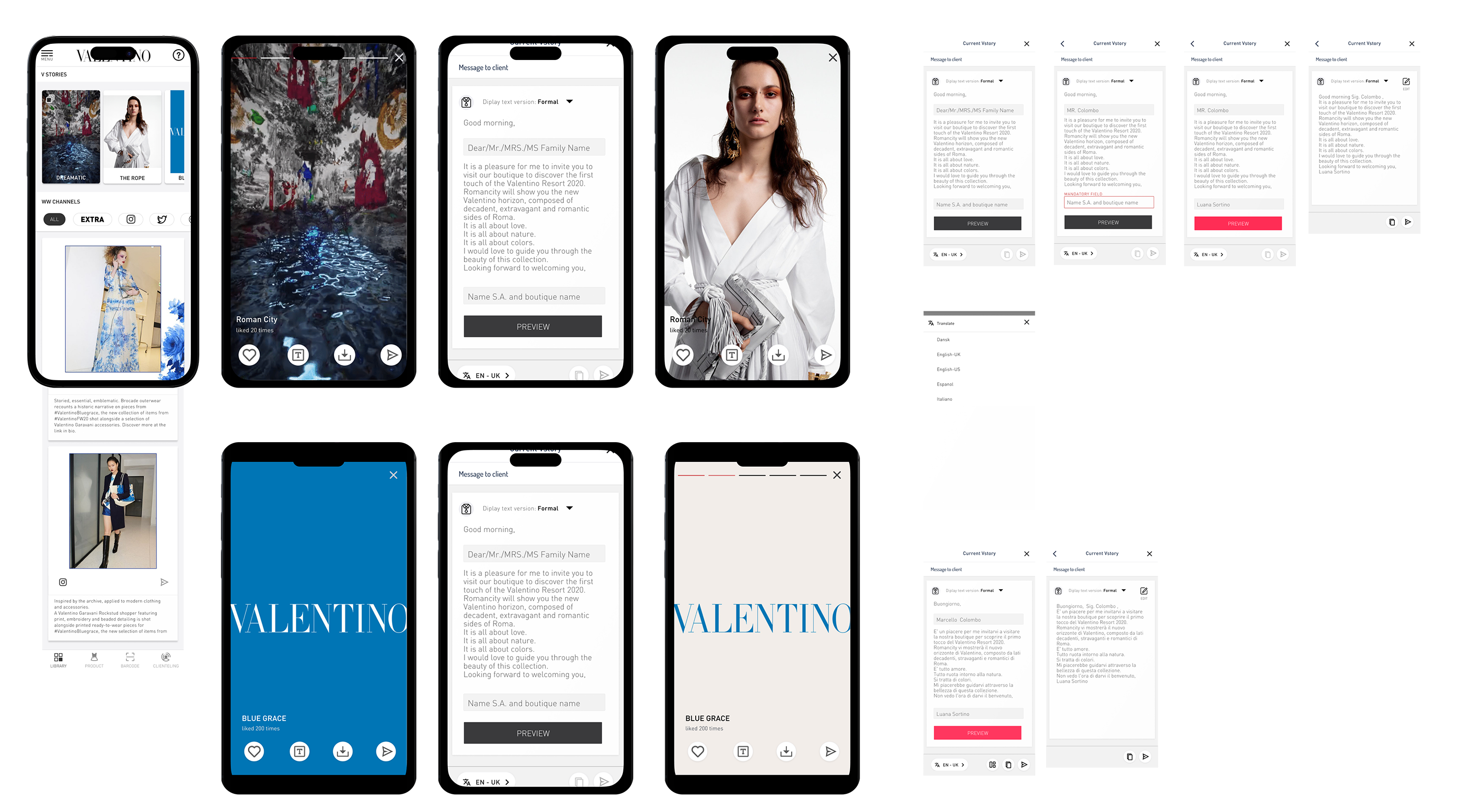
Increase the size of the Vstory Section: To make the Vstory section more prominent and engaging, we proposed increasing its size. This change would allow users to view more content without scrolling and make the section more visually appealing.
Preview Mode for Vstories: We proposed a preview mode for Vstories, allowing users to navigate and view Vstories in a condensed format before deciding to view the full content.
Enhanced Content Icon: To make the content more appealing, we proposed redesigning the content icon to be more attractive and visually engaging.
Vstory Preferences: To personalize the user experience, we proposed a feature that allows users to pin their preferred Vstories or change the order of Vstories.
Search Functionality: To enhance usability, we proposed adding a search function that allows users to search Vstories by argument or tags.
Shortcut for Sharing: To facilitate content sharing, we proposed creating a shortcut from the client page to the Vstory section.
Removal of the "Library" Title: To simplify the interface, we proposed removing the "library" title of the section.
Like Functionality: To encourage user interaction, we proposed adding a "like" feature to the Vstories. This feature would be anonymous to promote honest feedback.
Share Icon Update: To align with common user expectations, we proposed changing the share icon to a more commonly used design.
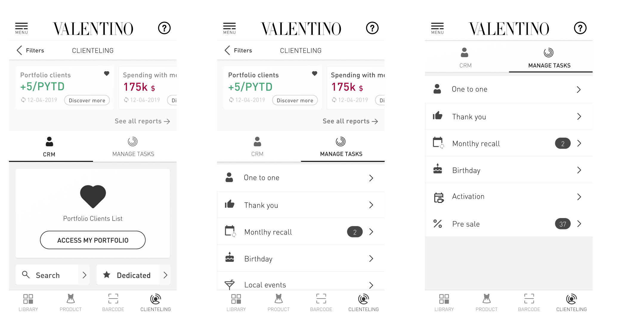
Clienting
The existing clienting page was excessively cluttered, leaving no room for the integration of new features. The primary step was to undertake an architectural reform to enhance the organization of the homepage and client page. This reformation aimed to create a more flexible structure that could easily accommodate future feature additions.